Missy Higgins is touring the country to celebrate the 20th anniversary of her trailblazing debut, The Sound Of White. Entitled The Second Act Tour, the show is performed in two acts with the first set including some brand-new songs, plus a few fan favourites from early in her career, all played in stripped-back, acoustic mode. After an intermission, Missy returns with her full band to perform The Sound Of White in its entirety plus some of her other hits.

Lighting designer Kait Hall was tasked with creating two very distinct looks for both halves of the show which predominately she achieved through the use of colour in the first set and the lack of colour in the second.
In the first half, Missy performs solo arrangements on a grand piano or guitar, sometimes inviting some of her band to join in backing vocals and flugelhorn. It’s a mix of beautifully heartbreaking songs from her new album and a few fan favourites from the early years. The floor package was designed to make the space feel intimate despite the fact she’s often playing in huge theatres by herself. The lighting is highly saturated in colour which tries to emulate the emotional weight of the lyrics and the negative space on stage plays an important part in drawing focus to Missy.

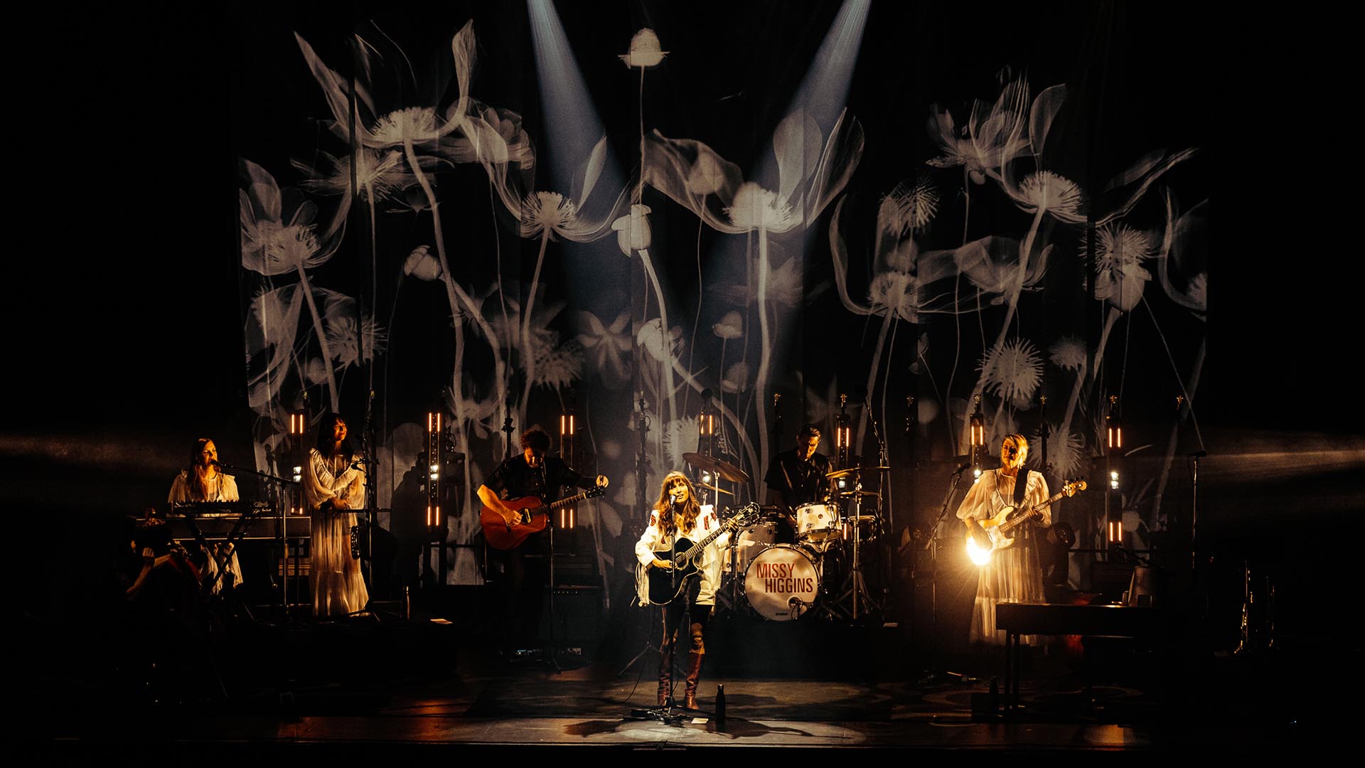
For the second act, Kait wanted a distinctive aesthetic for this half and decided to make the set, costumes, drapes, projection and lighting only black or white. Using a palette that is purely monotonal makes it feel like a black-and-white film so it’s almost like the audience is watching the album being played in a distant time and space. The heavenly white costumes designed by Anna Cordell add to this otherworldly feel and a lot of the time the band are lit only from the side or from behind so they look very ghostly.
“Many of these songs have a very intense introspection which I represent visually by bringing the stage light down to a single light or simple static look,” commented Kait. “It’s crucial when working with artists like Missy that you embrace the “less is more” motto. Choosing stillness, shadows and darkness with intent can be infinitely more powerful than lots of flash and movement but it is challenging to be confident in a restrained design sometimes. Creating enough negative space to give songs the space to breathe is what helps to intensify the sentiment of the songs.”

Kait adds that the word “white” already has so much emotion and meaning attached to it in our culture so using an entirely white stage design works on our brains to subconsciously remind us of all the things that this album represented about Missy’s life as a teenager and young woman. The visual juxtaposition between this set and the first half which focuses on her self-reflections about motherhood and divorce is such a stark contrast.
Kait is fortunate to have toured with Missy for almost two decades so they have a trusted collaborative process. Usually, it starts with a discussion with Missy’s manager about a visual reference from the album artwork. Kait then creates a concept based on the reference and the budget then she illustrates her ideas with a style guide and CAD drawings. Once that’s been agreed upon by Missy and her management team, she has full freedom to move within that world.”
Like most tours, Kait’s biggest challenges were trying to fit within the allocated budget and schedule so there were always going to be compromises. This design went through many major pivots before Kait presented it to anyone in the Missy team.
“The first designs are almost unrecognisable now but I had the luxury to have several months to think about all the possibilities before finalising the idea I presented to management,” she elaborated. “Trying to find something that looks unique and distinctive and can still be toured overnight between capital cities is always going to create challenges but the floor dollies help to speed things up and give me lots of variation throughout the show.”

Knowing that she was only using varying shades of white light meant that it was much more critical for Kait to find depth and details in gobo textures, beam shapes and colour temperatures. To achieve this there were a few products that were not negotiable for her on this tour … the Claypaky Sharpy X Frame, Claypaky Panify and ShowPRO DiamondBack. Resolution X was one of the few companies that already had them in their inventory and they were also able to make all the custom metalwork that was needed to tour the floor package efficiently. Eve Conroy, Aqilah Tan and Jordan Wisby all toured at different stages over the run as system techs and Kait says that she couldn’t have asked for a better team to support her.
“I had toured with the ShowPRO DiamondBacks last year with Jet so I knew that the warm and cool LED strips plus the colour mixing bulbs were going to give me a huge range of patterns and beams,” said Kait. “I put them on ClayPaky Panify motors so they could be positioned or rotated in any direction which elevated the look significantly and made them much more versatile.
“Sharpy X Frame has some incredible gobos for wide-angle beam looks that can easily fill a lot of space and they are relatively compact for what they deliver. Unlike other framing units, you still get quite a large range of gobos over two wheels which is critical on this tour. I use a single X Frame to backlight Missy at her keys and it’s one of the most talked about looks I have ever done and yet it’s one single light.”

Kait used a combination of Ayrton Diablos and Martin MAC Encores to add additional layers of gobos from overhead and the sides. She mixed up the gobos from the standard set because she used them to paint the band and the floor in textures that echo the projection elements. Ten Diablos on the front truss are used for the keylight.
“Diablos are so compact it means that most theatre fly bars can handle the weight of a large number of fixtures and you can easily rope them up to a bridge if necessary,” she added. “I also use a row of warm and cool light bulbs that are on push-up stands that get changed around at the interval. They are in an arch for the first half so it fills a lot more of the back wall space. It was a happy coincidence but halfway through the tour Missy unveiled a new song about standing under the Sydney Harbour Bridge on New Year’s Eve and it acts as a nice metaphor for that song. During the second act, I lower them all to one flat line to give the projection area more uninterrupted space.”
Kait wanted to do this tour with an MA3 so that’s the way she started programming but some features were still lacking in the version 1 software so she switched to MA2. Frustratingly, the week after she had made that call, the version 2 software came out which had addressed all her hesitations! However, the money saved on using the older console meant she didn’t have to compromise other things that are more obvious to the audience but she still hopes to switch to MA3 when she has a chance.

“It was great to use the Capture suite at Res X for the bulk of the pre-programming but there were some elements, like the custom floor dollies, that I needed to set up in the factory for a few nights to get a good understanding of how they would balance with the projection,” explained Kait.
Originally Kait had wanted to avoid screens or projection for this show and she was going to do all the back imagery with custom gobos. However, as she started to finalise the kinds of images she wanted to use, she started to worry that a gobo wouldn’t give her the kind of control that a projector can when it comes to correcting image distortion.
“If it’s a one-off event you can compensate for weird angles when making the custom gobos but this tour had 39 shows that needed to adapt easily from the largest theatres in the country to small Regional Theatres, Concert Halls and Entertainment Centres,” remarked Kait. “The choice to use a projector was more about the ability to correct distortion rather than have moving images. Having said that, once we committed the projector to the budget, we took the opportunity to add subtle movement elements as well.

“I had been collecting lots of black-and-white images and reference photos for about four months leading up to the tour before I presented the idea to Missy. I did a style guide where I illustrated how each song would “feel” and look. I think when you come to an artist with such a different concept to a normal show it can be pretty hard to visualise for them so I tried to make the style guide as detailed and specific as I could while still leaving room for the ideas to grow.”
For the first time, Kait collaborated with video artist Rachael Johnston to animate the reference from the style guide. She adds that while most of the content is pretty similar to the original idea others evolved into something completely new so it was nice to bounce ideas around with someone else this time.
Photos: Mitch Lowe, Simone Gorman-Clark


